Mobile banking application for individuals
In January 2019, Alfa-Bank hosted a design competition inviting everyone to submit their concept for a new mobile application. I participated in the contest and secured 2nd place. Below, I’ll describe the concept I proposed. In developing the solution, I started with the following hypothesis about why users need a banking application:
-
Account Status: Users should be able to quickly view their account balance, funds, and liabilities.
-
Transactions: The app should facilitate making transactions, transfers, or payments.
-
Services: Users should be able to access various services such as viewing transaction history, analyzing expenses and receipts, opening or closing products, seeking assistance, adjusting limits, and modifying settings.
Main Screen
The main screen provides an overview of all the client’s finances, including accounts, deposits, loans, and investments.


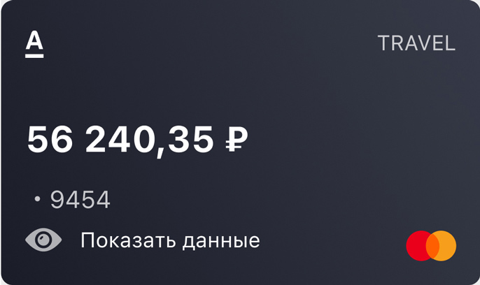
Debit Card Field.

The credit card field displays the available balance from the credit limit.
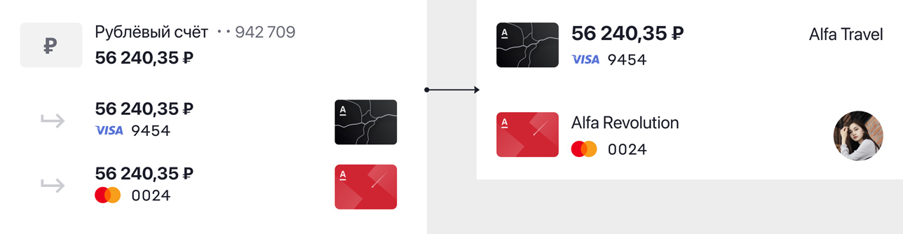
From Account Bills to Cards
Accounts and associated cards are typically listed one after the other, as multiple cards can be linked to a single account. I opted for a different approach to optimize space and simplify financial management. This design simplifies finance perception by focusing on cards rather than accounts. Here’s how it works:
An additional card is combined with the main card into a single block.
For example, if the client has a debit card linked to a ruble account and then buys foreign currency, a foreign currency account will be created for the purchase amount. Then, the client links the card to the foreign currency account. The currency balance is displayed on the card, and the ruble account remains visible on the page.
![screenshot]()
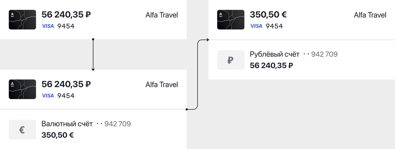
Drag and drop to quickly transfer money between accounts using a drag-and-drop feature.
Main Screen Customization
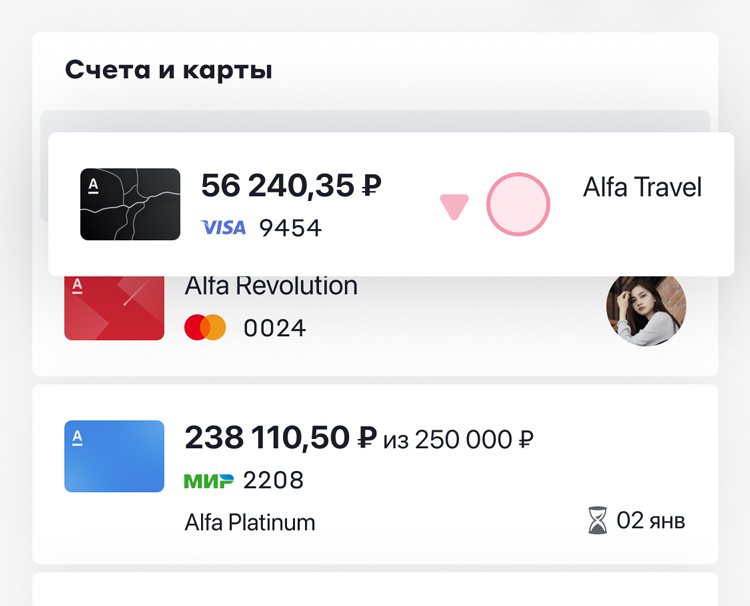
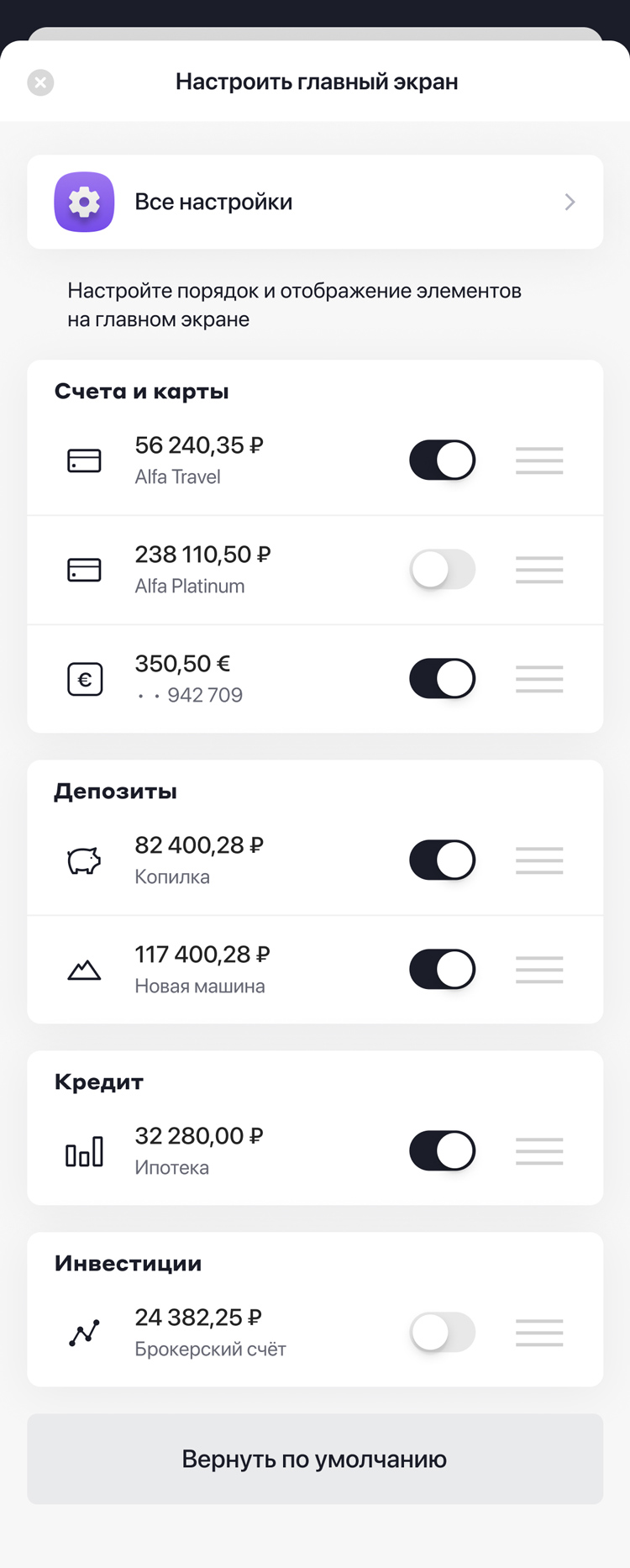
You can customize the order and display of items on the main page to suit your preferences, including hiding certain accounts.
![screenshot]()
![screenshot]()
This field provides access to all application settings, as users often look for these options under the settings icon on the main page.
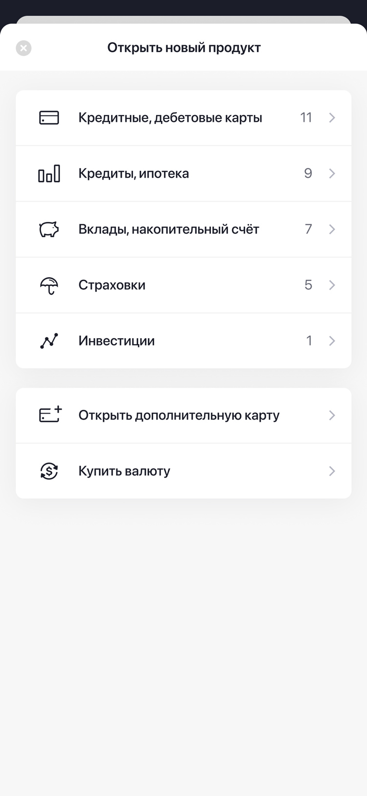
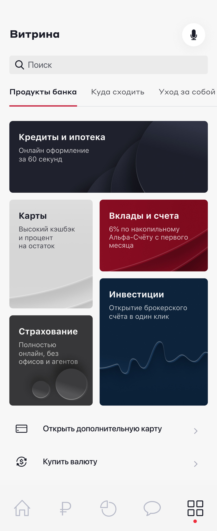
Products Page
![screenshot]()
![screenshot]()
The product page appears when you click the corresponding button from the main screen.
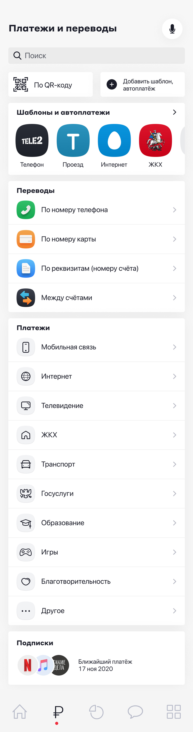
Payments and Transfers
This screen is quite detailed, featuring around 20 categories. To manage this complexity, I arranged them in a straightforward list, visually separating the two main directions. Templates appear in the block as you add them.
![screenshot]()
![screenshot]()
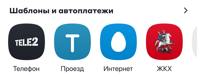
Block with payment templates and frequent transactions.
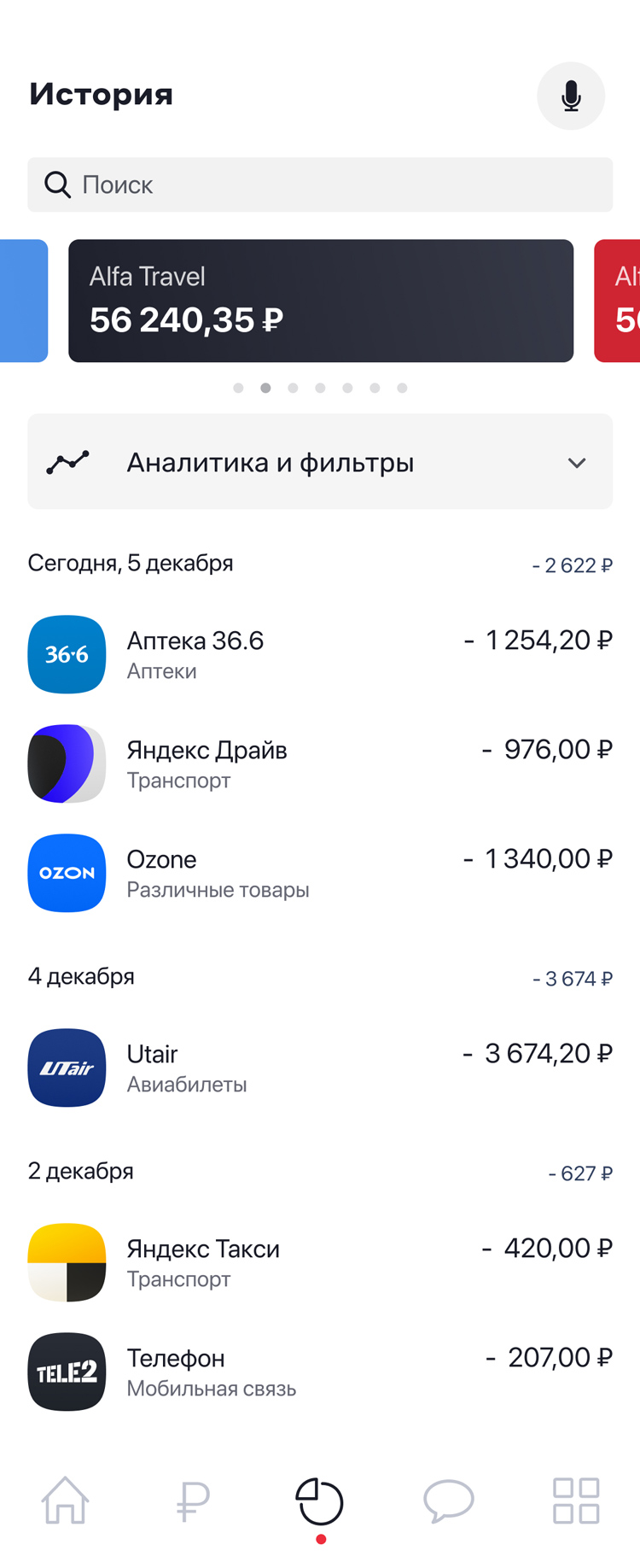
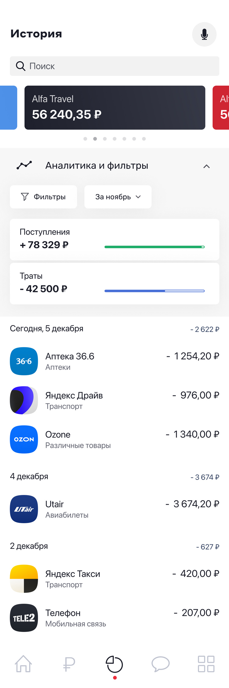
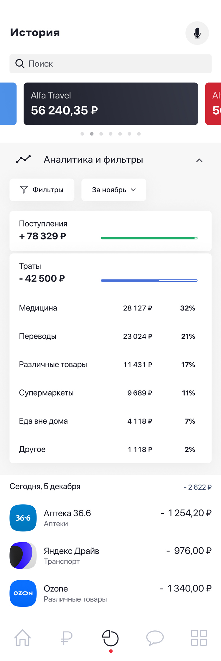
Operations History
To save space, a card or account is selected in a small compact slider. Filters and category selections are handled in a sequential list for a streamlined user experience.
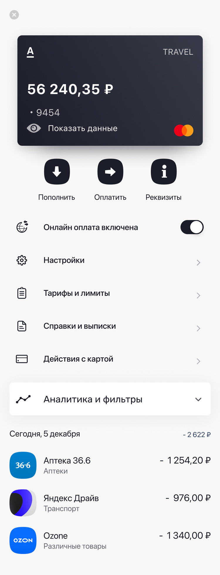
Card Page
![screenshot]()
![screenshot]()
Clicking the eye icon reveals the card details.
Communications
On the contact page with the bank, you’ll find a block with stories, including useful information, analytics, and promotional offers. There’s also a chat feature for communicating with the bank, as well as a chat with engaging content.
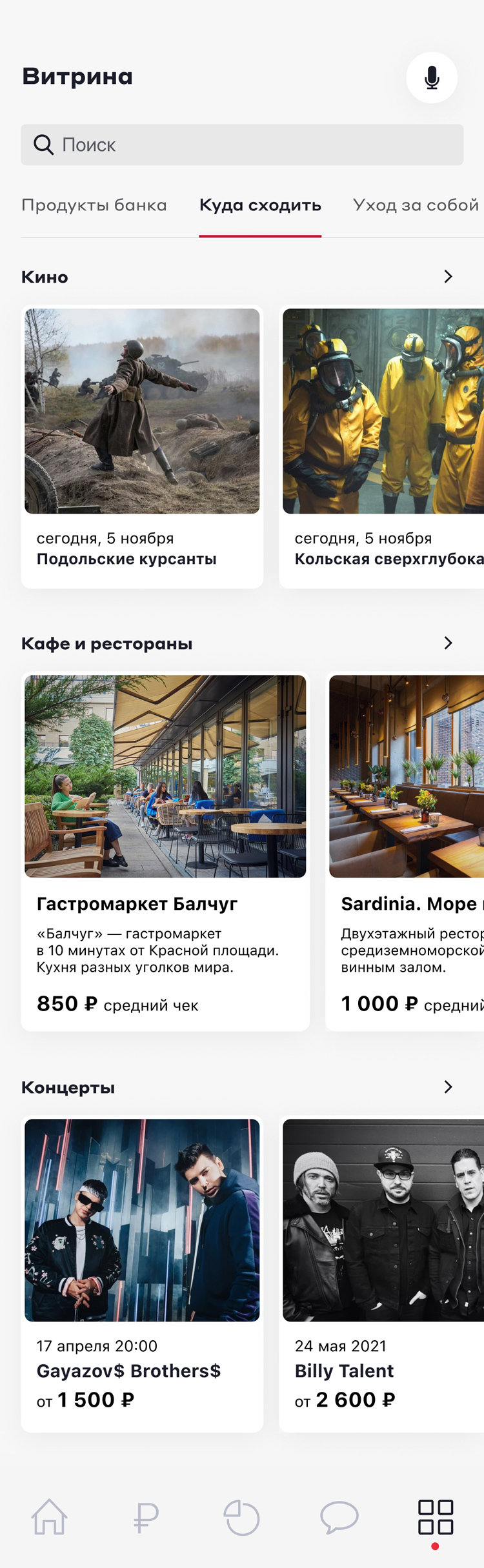
Product Showcase
While the concept of a super-app in a banking application can be controversial, it’s important to test this idea. I would integrate bank products with a range of other offers. The tab with categories allows for combining the main showcase of banking products with additional options, minimizing cognitive load.